EPIC GAMES: WEBSITE REDESIGN
After looking at Epic Games’ current website, I noticed that it seemed to have received less attention and love than the Epic Games Store. This is a conceptual homepage redesign created in Figma as a personal UX/UI project. The aim was to reimagine Epic Games’ main website, while retaining its brand identity. I redesigned the main homepage, focusing on improving the current design while keeping Epic Games’ branding at the forefront.
Introduction
Through my experience with gaming platforms, I’ve noticed a recurring trend in video game websites: many act as little more than extensions of their respective stores. This- while it’s not always a bad thing – doesn’t typically do a great job of distinguishing the store from the many others out there. Epic Games is one such example. The current Epic Games website closely mirrors the Epic Games Store, offering little insight into the company’s unique strengths or wider ecosystem. Compared to competitors such as Steam, the site lacks personality and does not clearly communicate why users should choose Epic. This redesign aims to better highlight Epic Games’ offerings and identity, while remaining consistent with its brand.
The Old Website’s Flaws
Before beginning the redesign, I evaluated the existing website and identified several areas for improvement. The most immediate issue is the layout, which relies heavily on a basic grid structure. While functional, it feels static and lacks visual hierarchy, with few elements breaking up the flow of the page or guiding the user’s attention.
Navigation is another major weakness. The primary menu is accessed by hovering over the Epic logo, an unintuitive interaction that is not immediately obvious to users. The resulting dropdown menu feels cramped, where a traditional megamenu could provide more clarity and breathing room for navigation items. Additionally, once the user scrolls past the header, the menu disappears entirely, making large portions of the site difficult to access without scrolling back to the top. Additionally, the footer is crammed with links and resources, but the page is so long that it takes a long time to reach the footer, meaning the majority of users will never reach this menu.
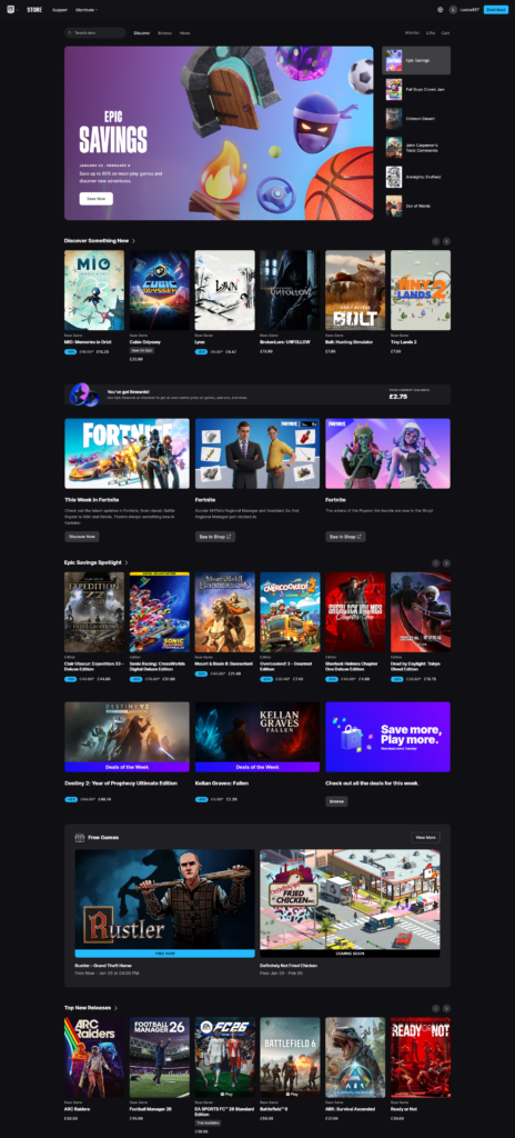
The site itself is basically a carbon copy of the Epic Store, with a heavy focus on promoting games over the company. There is not much information on the main page about Epic or how they stand out from the competition. This is especially important given that Epic primarily competes with Steam, an ever popular gaming store with millions of users.
One of Epic’s strongest incentives – the weekly free game giveaway – is only mentioned once, near the bottom of the page. Additionally, Epic’s mobile app, which also features free game giveaways, is not promoted anywhere on the main website. These missed opportunities significantly reduce the visibility of some of Epic’s most compelling features.
Goals for the New Website
Before even mocking up designs, I wrote out the goals for the new website – what the new design should achieve that the old website doesn’t. This is a key step in web design – starting designing without clear goals is the first step to ending up with something muddled and directionless.
The first goal was to create a more engaging layout by introducing varied content blocks that break up the page and establish a stronger visual hierarchy. I also decided to replace the confusing existing navigation with something more traditional and simpler to use, including a direct link to the Epic Store. I’ll move a lot of the footer links into the main navigation as well, utilizing a double-layered approach to present all the links without the navigation becoming overwhelming.
Finally, I wanted the website to place greater emphasis on Epic as a company. This meant introducing content blocks that highlight Epic’s services, free game giveaways, and mobile app, rather than focusing exclusively on individual games.
Navigation & Hero
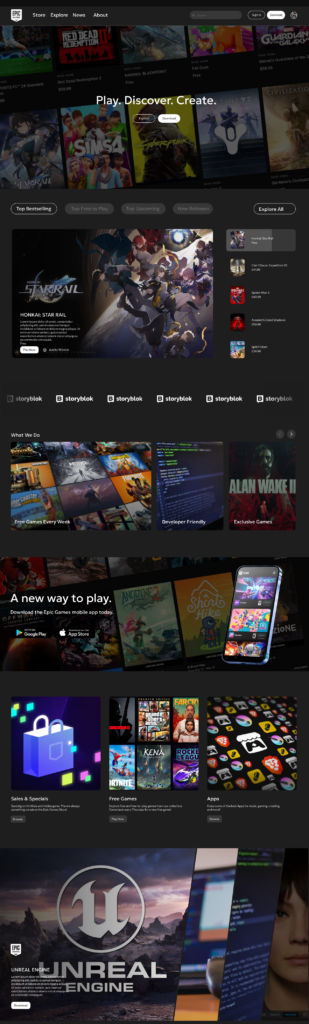
I started the redesign with the navigation, revising the confusing approach of hovering on the logo with a more traditional horizontal navigation. The primary navigation includes Store, Explore, News, and About. User-focused actions – such as search, account access, language selection, and a store download button – are positioned on the right-hand side of the navigation for easy access.
The Store and Explore sections contain the main navigational content, based on Epic’s existing categories of Play, Discover, and Create. These are aligned to the left, allowing space on the right for subcategories, featured content, and highlighted games or articles.
The News and About sections focus on Epic as a company, surfacing information about events, updates, articles, and guides that were previously buried in the footer. This ensures important content is accessible directly from the main navigation.
For the main hero, I wanted a simple design which combined showing Epic as a company while showing what they offer. The hero section was designed to be simple while clearly communicating both Epic’s identity and its offerings. I used an angled snapshot of the Epic Games Store to add visual interest, paired with a dark gradient overlay and white text for contrast and readability.
Epic’s tagline, “Play, Discover, Create,” is prominently displayed, and two clear calls to action are included: one encouraging users to explore the website further, and another prompting them to download the Epic Games Store application.
Block Design
I kept the sliding store block from the original website, as I felt that it effectively showcases a variety of games in an interactive format. Beneath this, I introduced a new slider block dedicated to Epic’s offerings, including the weekly free game giveaway. Placing this content higher on the page ensures it is seen by a larger portion of users. The block uses an asymmetrical layout, giving the first article more presence. This helps to draw attention to the first article, rather than giving all three equal weight, allowing one article to stand out as priority among the rest.
To promote the mobile app, I added a dedicated call-to-action block using a similar background style to the hero section, creating visual consistency across the page. The block shows the mobile app in-situ, and includes a catchy title and download buttons for the two major mobile app stores.
Next, I introduced a three-column grid block, with each column given equal weight. This creates contrast with the previous asymmetrical layout and adds visual variety. The block categorizes Epic’s content into Sales & Specials, Free Games, and Apps, allowing users to quickly find content relevant to their interests.
I added a unique diagonal block creates more interactivity, promoting Epic’s partner apps such as Unreal Engine and MetaHuman. This block automatically scrolls or can be manually controlled by the user, expanding to reveal additional information and call-to-action buttons. Its unique shape and motion add a sense of interactivity and energy to the page.
As the page approaches its conclusion, the design becomes simpler, transitioning into a basic grid block followed by a final call-to-action. This mirrors the hero section and reinforces a consistent design language throughout the site.
The footer remains largely unchanged, though the lower section was redesigned to place legal links and terms above newly introduced social media links, improving clarity and accessibility.
Conclusion
This redesign addresses the key issues identified in Epic Games’ existing website while maintaining the company’s branding and values. By improving navigation, introducing a more dynamic layout, and shifting focus toward Epic as a company rather than solely a storefront, the website better communicates what makes Epic Games unique.
The result is a homepage that complements the Epic Games Store, rather than competing with it, while providing users with a clearer, more engaging introduction to the Epic Games ecosystem.